My Process
Research, synthesis, redesign.
Generative & evaluative research
I directed research operations across 100+ diverse stakeholders — academics, technologists, and public partners — synthesizing qualitative data into a centralized insight repository structured for non-technical partners to use in curriculum and product decisions.
Synthesis workshops
I facilitated 5+ cross-functional synthesis workshops applying instructional design principles to move a room of competing perspectives toward a single shared articulation of product purpose. That alignment is what made the redesign possible.
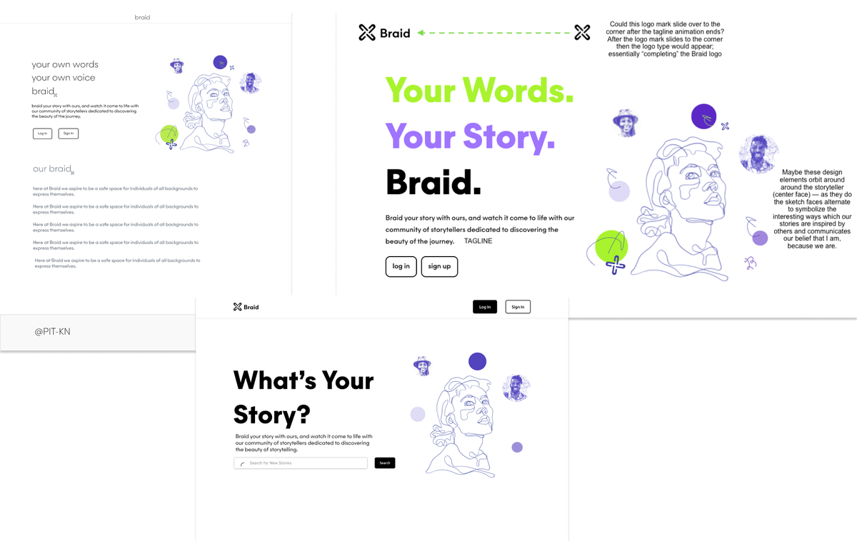
Design explorations — three homepage directions explored alongside messaging and brand hierarchy decisions.
Prototype, test, ship
High-fidelity Figma prototypes, usability testing with first-time visitors and existing members, engineering handoff and iteration. The visual identity was rebuilt from scratch — including a new brand mark drawn from the West African Ife knot, embedding the community's roots into the identity rather than decorating around it.
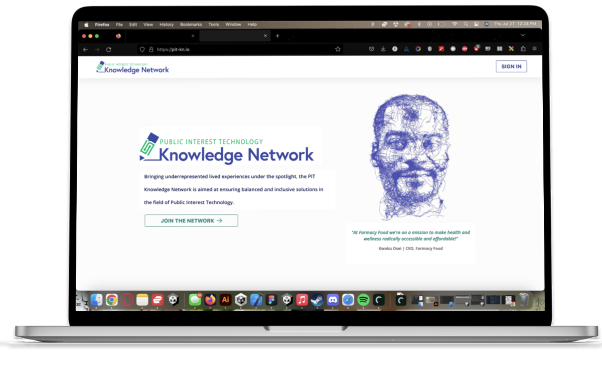
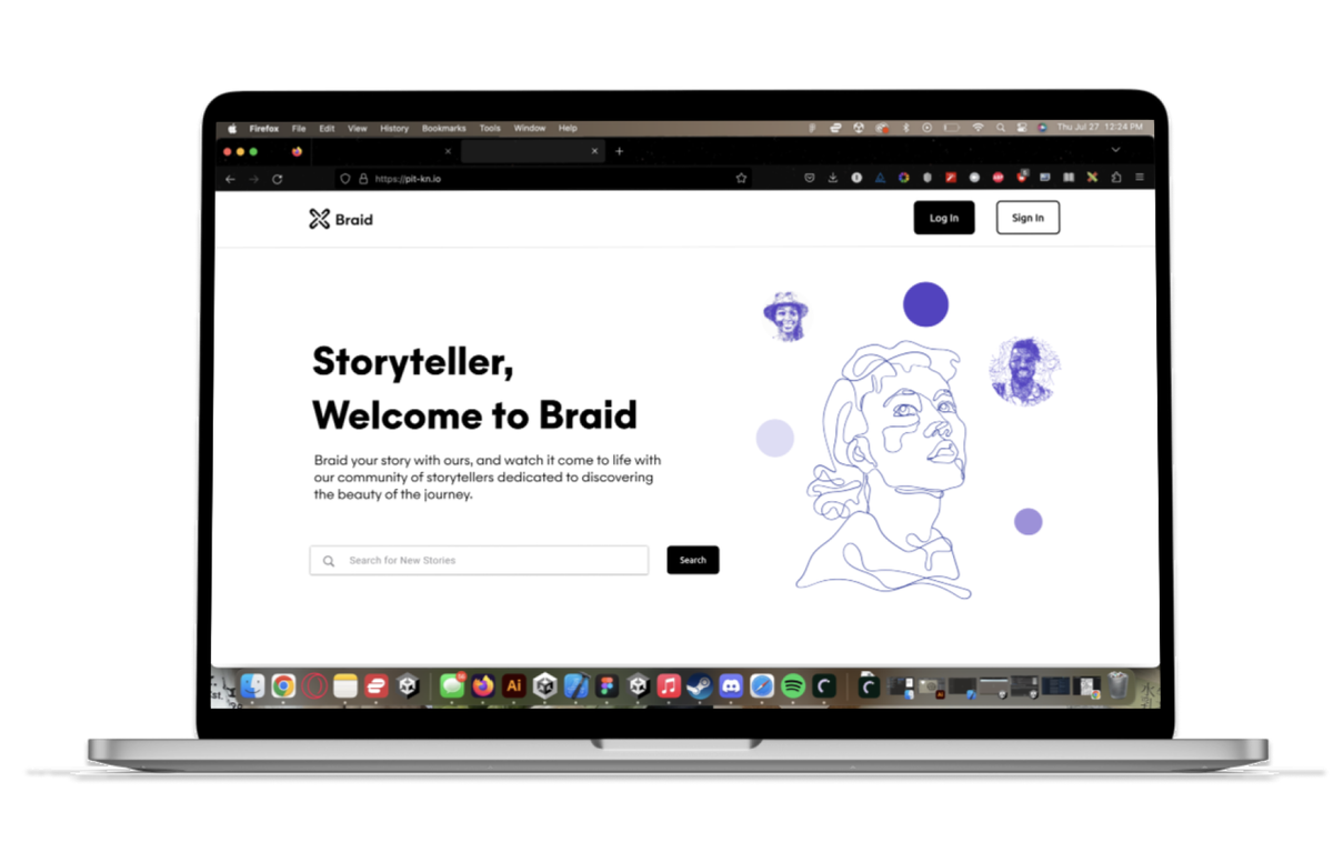
Before → After. Same product, different story — the redesign led with who the community is for, not what it is.
Logo evolution — from the original mark through the Ife knot-inspired final Braid identity.